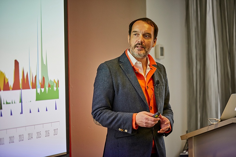
During his recent keynote at EA Connect Day US, renowned data journalist and information designer, David McCandless, shared his creative approach to data visualization. His mission is simple: tell meaningful stories through data. How he gets there is more complex. He gathers and presents public data points in a cohesive, engaging, and eye-pleasing way to uncover what is important and ultimately tell meaningful stories. He reveals unique perspectives on data, bringing deeper levels of information to the surface. His universal design language unlocks data and statistics, makes them more digestible, fostering conversation and collaboration.
There’s lots of learnings here for EAs working to track, manage and maintain modern IT landscapes. Below are a few of our favorite examples from David’s powerful presentation. We hope you are inspired as we were! Watch his full talk here:
Using visualization for analysis
Have you ever walked into a packed stadium and tried to guess how many people were surrounding you? Were you way off? Analyzing high-volume data can be overwhelming. But, when you take abstract data points and convert them into an accurate, sizable visual, you develop a different relationship. You can see raw data points, patterns, links, and connections that would otherwise be scattered across multiple sources. The story often isn’t in the data itself -- it’s in the gaps, connections, patterns, and links that emerge when data is visualized to further contextualize numbers that are so huge we can’t wrap our minds around them.
Visualization can unveil many storylines we aren’t even aware lie in our data. Landscapes of data allow us to explore causes and correlations, and take a piece of information and turn it into an experience.

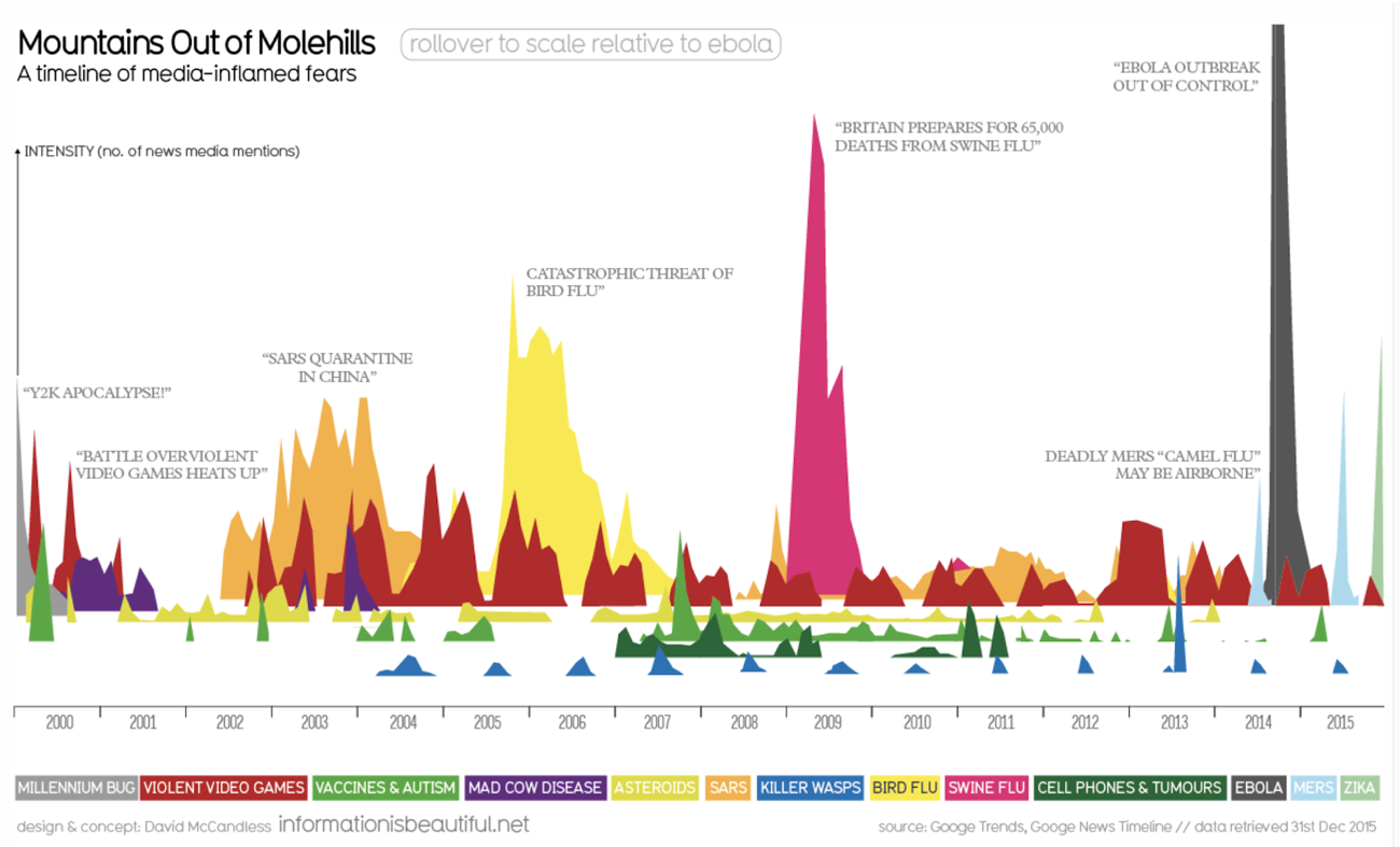
Mountains out of Molehills (2015) reveals common themes that pushed stories in the media to the front stage, with the most common being fear.
Data is the new soil
There’s a saying that “data is the new oil” -- which refers to data powering innovation in the 21st century -- but McCandless felt the need to slightly alter the cliché. Using visualization, data becomes the soil, or the new matter that allows us to reveal fresh perspectives, allowing our ideas to bloom.
Visualization has found its medium
We expect information through smartphones and on the internet to be visual, authoritative, and accessible, but visualization takes combining the language of the eye (color, patterns, shapes) with the language of the mind (numbers, ideas, words). Data relates to visualization and information relates to the mind -- both enhancing the other. Think of visualization as the new camera. What kind of shot do you want to take? Is it wide or zoomed in? Is what you’re focusing on in the foreground or the background? Is it in focus or out of focus?
If you take a wide shot, you can map the data out and see it from above.
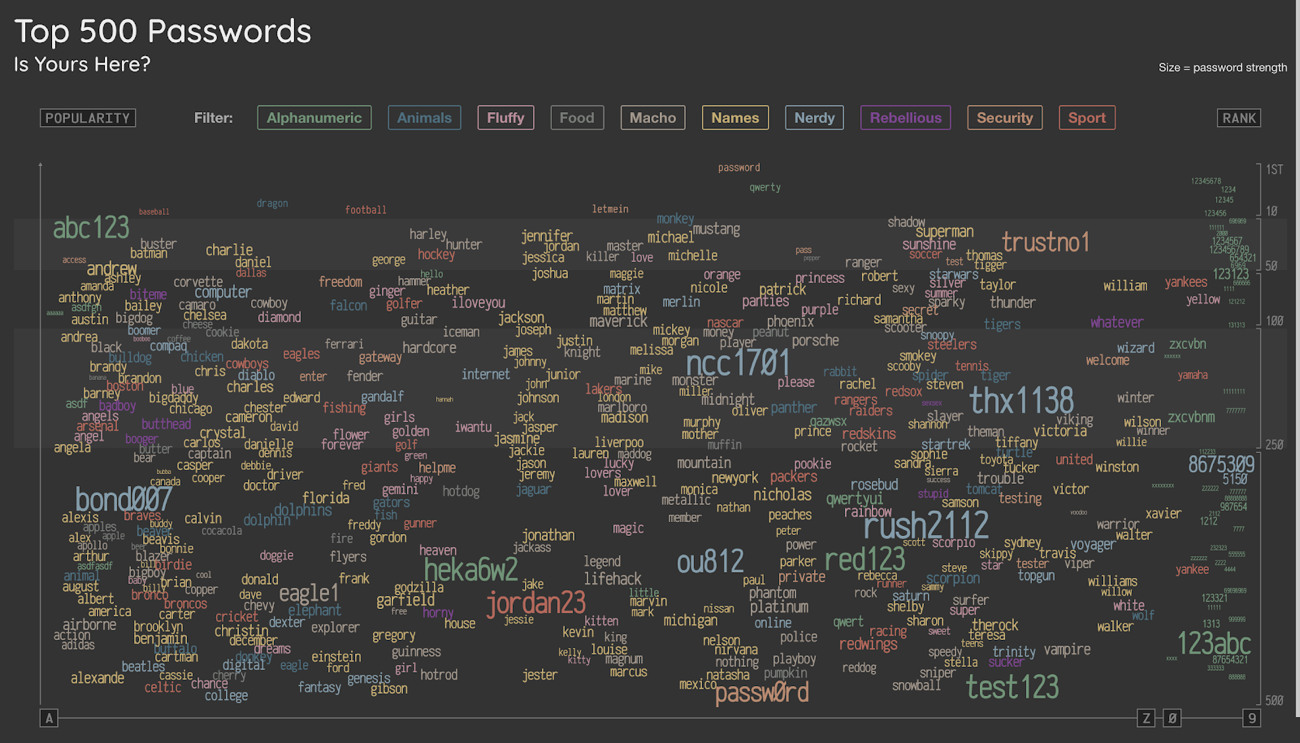
In Top 500 Passwords (2018), McCandless categorized password weakness from top 7 global data breaches. The passwords are categorized according to theme: sports, names, animals, etc. Looking at the wide shot of this amount of data reveals a new view, which allows us to then drill down, make categories, spot patterns, and build stories. 
Data <> Knowledge <> Beautiful
Our world expands when we look at data in new ways. As the demand for modern sensibility and color increases, we must continue to create well-designed visuals that result in a large impact. When you perceive a captivating object and have the ability to truly see something in an instant, your brain thinks it’s interesting; well-structured information is beautiful to the human mind.
How are you using the power of data to tell your Enterprise Architecture story?
.png?width=140&height=107&name=BTMPlaybook-FI%20(1).png)

